Hello Strategeists,In our first dev diary, we showed you the rough target we were heading towards. We’ve been making progress towards that on the HUD.
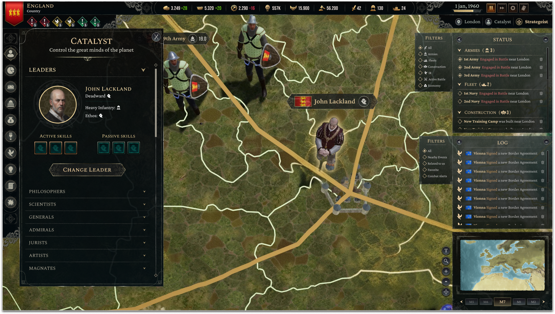
HUD
We have more to do: we plan to rework the mapmodes/toggles, and have further tweaks to the minimap, central top bar, status and event sections, and general polish. Additionally, we have started production on new icons, but none of them are yet incorporated yet.
Screen Improvement
While this work continues, we have also been doing work on improving our existing panels. We are collaborating with an external UI/UX design studio (Auron) to redo our interface. It's a very large overhaul as it was clear that we had a number of issues throughout. Too much information in some places, not enough in others, a heavy reliance on icons, a lack of hierarchical structure, and so on. The sins are many and they’re mine.
We've been doing a lot of analysis and wireframing to figure out directions, looking of course at state-of-the-art and considering our own game mechanics. For instance, given our 3D globe, the minimap remains extremely useful to quickly jump around, even though other titles have managed to eliminate it and save valuable real estate through clever zoom.
Case Study: Ethos screen
In Strategeist, Ethos is designed to represent the values of a society and what it prizes. Are we [on average] bold or timid? Do we prefer calculation or impulsiveness? Both have their benefits and drawbacks. The original design was inspired by policy sliders in other games. Pretty simple, right? Wrong.
Ethos screen, c. Jan 18th There's a number of things going on here; we have claimed the central real-estate of the screen, which maybe is okay for this particular function, but definitely needs to be justified in a game where the map plays a central component. We relied extremely heavily on tooltips at first, you had to mouse over the buttons to see the results of going one way or the other. So trying to compare left and right meant moving your mouse around & trying to remember what the exact effects are. Not a great workflow.
Ethos screen c. Feb 11th Somewhere in late January, we had had a request from Auron that rather than try to aim for a complete overhaul all at once, it would be helpful to reduce the distance between our wireframes and reality. We got to work, first starting with moving the menu bars from the top to the left. And secondly we standardized all menus and required them to fit in the space to the left. This is now our default stance, and we feel that any deviations have to be justified, rather than taking up central space from the map by default, which was our previous approach.
We also received a basic UI toolkit and some basic instructions which allowed us to revamp the UI. Mostly we ripped out the green backgrounds, replaced it with a much nicer background, and tried to obey some basic font hierarchy rules. Even that made a nice visual difference. But the basic UX flow was still the same even so, and the visual organization also needed improvement. And a lot of screens were a bit awkward because they had previously been horizontally dominant and now were suddenly vertically dominant.
Ethos mockups. We worked on some mockups on how to improve the visual layout and information presented within the screen. These would guide the next phases of our process and the true reworking of these screens.
Specifically here, we can see here the effects of going left and the right on hover, and there's an additional confirmation step to prevent accidentally making a choice that you can't undo. We had to develop some stacking tooltip tech which has become fairly standard in the strategy space.
We've added another tab to better convey overall status. By mid April, we finished up most of the elements on the ethos screen. At this point, the bones are mostly in, but there’s still finishing touches ahead. We’re doing this across virtually every screen in the game, and currently we are focused on closing the gap between implementation and mockups. We will be adding final artwork and polish in the upcoming monthsThat’s it for this update. If this is something that interests you and if you haven’t already, please consider joining our discord, and signing up to playtest — we will need your help ultimately to deliver a great product!